- #granvilleoils #tradeshow #motortradeshow 1
- 0w/20 1
- A Bit Of Fun 2
- Abro 1
- Additive Packs 1
- Additive tanks 1
- Aftermarket 4
- Air Conditioning 4
- Antifreeze 9
- Article 2
- Auto Express 1
- Automatic Transmission 2
- Automechanika 5
- Automotive 35
- Autosol 3
- Autumn 2
- award 1
- Awards 2
- Baring 2
- blow moulding 1
- bottle 2
- bottles 1
- Brake Fluid 1
- Brakes 2
- Brand Focus 2
- Brands 1
- brochure 2
- business 1
- C3 2
- C4 1
- Capacity 1
- Car Wash 5
- carcare 2
- carcleaner 1
- carinterior 1
- Cars 5
- Catalogue 3
- Chemical 7
- chemical plant 1
- Cleaners 1
- Cleaning 10
- cockpit shine 1
- cockpitshine 1
- Cold Weather 4
- company 1
- company brochure 1
- Coolant 5
- Corporate 5
- cutting-edge 1
- design 4
- Dexos 1
- dv5r 1
- eb2dt 1
- emergency puncture repair 1
- engine oil 3
- ep 1
- EV 1
- evolution 1
- Facts 6
- Flunkey 1
- Frankfurt 3
- FS 1
- fs pc 1
- fs rn 1
- Fuel 1
- Garden 1
- Gear Oil 3
- Germany 3
- Granville 8
- Granville bottles 1
- Granville brochure 1
- Granville catalogue 1
- Granville new tanks 1
- Granville Oil 42
- Granville Oil tanks 1
- Granville Oils 2
- Granville Oils Site 1
- Granville tank farm 1
- Granville tyre repair 1
- granvilleoil 4
- graphic 1
- Grease 2
- Gunk 1
- History 1
- homepage 1
- Hypalube 4
- identity 1
- ISO 14001 1
- James Bond 1
- James Holland 1
- logo 1
- Lubricant 18
- lubricants 2
- lubricating oils 1
- Machinery 2
- Maintenance 20
- Manual Transmission 3
- manufacturing 1
- Mechanic 3
- mid saps 2
- motor 2
- Motor Factor 2
- Motor Oil 22
- motoring 3
- Motoring Problems 16
- mtf 1
- new engine oil 1
- new fully synthetic oil 1
- new Granville product 2
- new logo 1
- new packaging 1
- New Product 9
- new products 1
- NGLI 1
- Nova Car Care 3
- Nürburgring 1
- OEM 3
- oil 3
- packaging updates 1
- Paint 1
- Pets 1
- plastic 1
- PMF 1
- Polish 1
- Powertron Ultra 1
- premium oils 1
- product 2
- Product Feature 4
- Product Release 8
- production 1
- Products 3
- profinish 1
- puncture repair product 1
- Rain X 2
- Range 1
- rebrand 2
- rebranding 1
- recruitment 1
- refresh 1
- RN17 FE 1
- Screen Wash 1
- Screenwash 1
- September 2
- Show 1
- Sintron 1
- smartphone 1
- Spring 1
- staff 1
- stop start 1
- Summer 2
- tank farm 1
- tanks 1
- team 1
- Technical 22
- technolube 1
- Trade Show 5
- transmission 1
- Transmission Fluid 6
- Turtle Wax 4
- tyre aid 1
- Tyre Safety 1
- Universal 1
- upgrade 1
- Valeting 9
- Veedol 10
- Veedol OEM 1
- Ventilation 1
- Wax 1
- website 2
- Windscreen 3
- Winter 3
- workmilestone 1
- 2024
- Oct 1
- Sep 2
- Jun 3
- May 2
- Apr 6
- Jan 1
- 2023
- Dec 1
- Sep 1
- Jul 2
- Mar 4
- 2022
- Nov 2
- Oct 1
- Sep 1
- Aug 1
- Apr 1
- Feb 1
- Jan 1
- 2021
- Nov 1
- Aug 1
- Apr 1
- Mar 1
- Feb 1
- 2020
- Sep 2
- Jun 1
- May 1
- Mar 1
- Jan 1
- 2019
- Oct 1
- Sep 2
- Jun 1
- May 1
- Apr 1
- Mar 2
- Feb 2
- 2018
- Dec 1
- Sep 2
- Aug 1
- Jul 1
- May 1
- Apr 1
- Mar 1
- Feb 1
- Jan 1
- 2017
- Jul 2
- Jun 2
- Feb 2
- Jan 2
- 2016
- Dec 2
- Nov 2
- Jul 4
- Jun 5
- May 3
- Mar 2
- Feb 3
- Jan 2
- 2015
- Nov 1
- Oct 3
- Sep 1
- Aug 2
- Jul 4

GRANVILLE LAUNCHES NEW IDENTITY WITH 2023 REBRAND
Article first published Thursday 30th Mar 2023 12:35
Following 20 years of the iconic rectangular red and blue tram tracks, we felt that the time was right for Granville to modernise our logo by introducing a more flexible and recognisable icon to combine with the traditional Granville font.
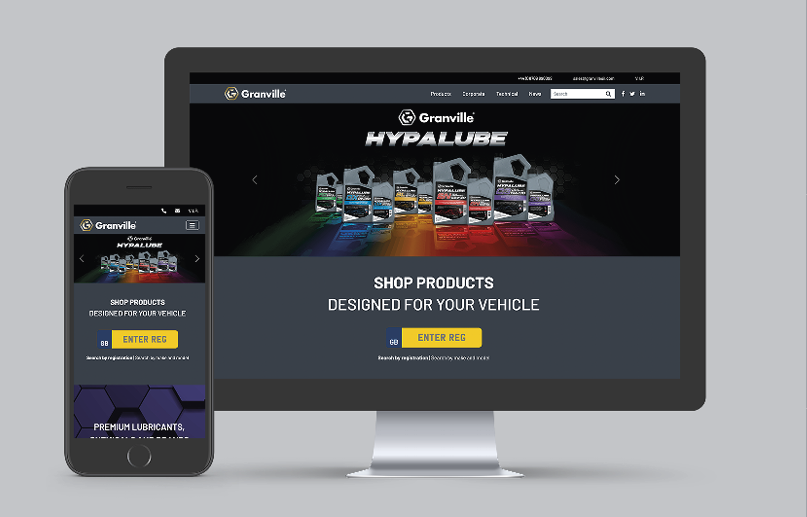
GRANVILLE LAUNCHES NEW 2023 WEBSITE
Article first published Wednesday 29th Mar 2023 09:00
Alongside our rebrand, it was decided that our website look and feel would also need a refresh to reflect the exciting changes happening within our business.
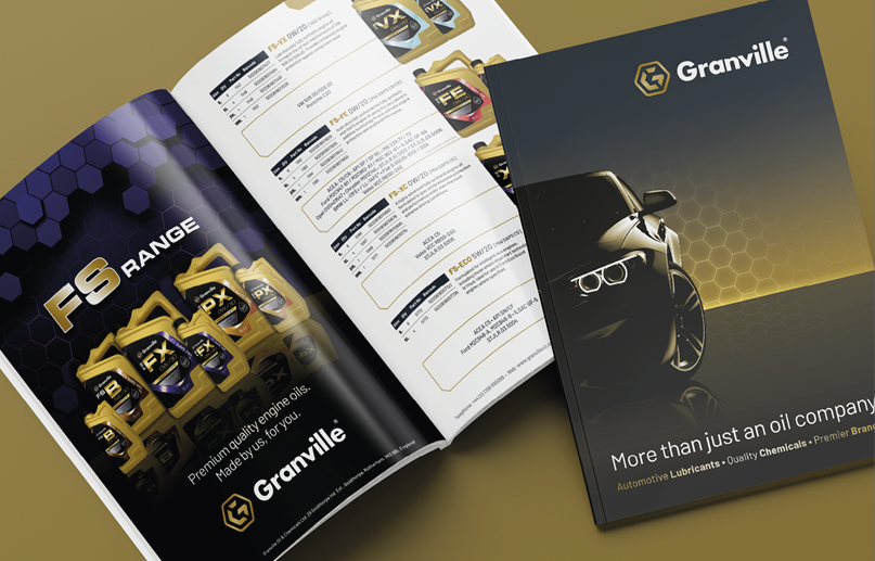
2023 PRODUCT CATALOGUE NOW AVAILABLE
Article first published Wednesday 15th Mar 2023 12:35
We’re happy to announce that our 2023 brochure is now available for download here.
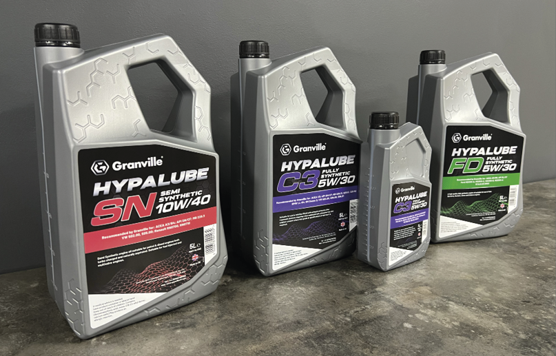
GRANVILLE LAUNCHES NEW BOTTLE AND LABELS
Article first published Wednesday 1st Mar 2023 12:40
Whilst rebranding, we decided to introduce a completely new look and feel to the Hypalube range, with the new trade bottle being the first to embody the new look of Granville. The strong lines and sharp corners are tempered slightly with rounded corners for a modern look whilst the bottle remains unmistakably Granville with the addition of subtle hexagons to add interest and grip to the chunky easy-grip handle.